


Amazing exhibition stand design ideas
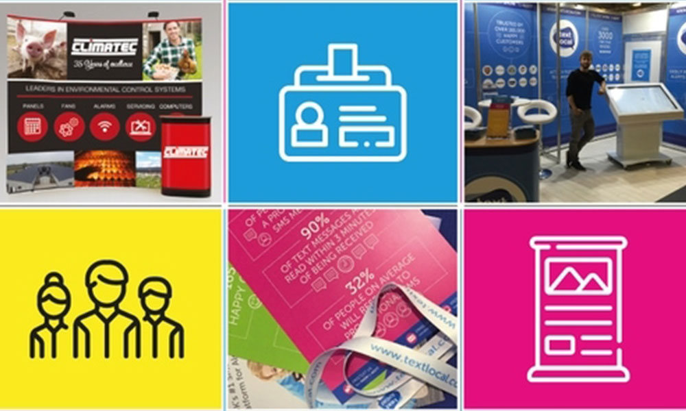
Amazing exhibition stand design ideas
July 14, 2021
7 Mins
How to level up your exhibition stand design
Despite the rise of the internet, physical trade shows and exhibitions are still a great way to do business. However, they’re only worthwhile if you generate an ROI. To do this, you must pay closer attention to your exhibition stand design.
With brands spending as much as 50% of their trade show budget on a stand, creating an eye-catching exhibition stand design is essential.
In the world of trade shows and exhibitions, your stand acts as your shop window. You wouldn’t scrimp on your window dressing, so it’s crucial to pay attention to your exhibition stand design.
With this in mind, we’ve pulled together some key factors to consider during the planning stages, plus some inspiring exhibition stand design ideas to get your creative juices flowing.
Why an eye-catching exhibition stand is important?
At busy trade shows or exhibitions, standing out from the crowd is half the battle. You must attract prospects to your stand in the first place before even considering walking them through the sales funnel.
With so many competitors congregating at one event, your exhibition stand design is your golden ticket to set yourself apart and steal a march.
Not only this, but your super exhibition stand design will leave a lasting impression on your potential clients long after the event doors are closed. So, choose wisely.
Different types of exhibition stands
Before you can get creative, you need to think about what type of exhibition stand you want. Generally speaking, there are three key types of exhibition stands:
• Modular designs
• Bespoke designs
• Pop up designs
The modular designs are usually made of an aluminium frame with fabric or printed graphics attached to make it pop with colour. These are fantastic for creating an impact and an entire zone for your brand to stand out from the crowd.
Bespoke designs are slightly more expensive and are custom built to specification. These types of feature intricate designs may look snazzy, but they’re often a lot harder to assemble and dismantle. A factor you probably don’t want to tackle if you’re pushed for time.
Pop up stands are smaller and easier to assemble. They’re mostly used for one-day exhibitions where speed and practicality are key concerns. Pop up stands are also a cheaper alternative to make a maximum impact with ease.
How much does an exhibition stand cost?
As highlighted previously, brands often spend up to 50% of their budget on their exhibition stand design. This figure can range between £50-£50,000, depending on the exhibition, the size of the business and the allocated exhibiting space.
One thing to consider before investing in a lavish design is the return on investment (ROI). After all, you don’t want to spend thousands on your exhibition stand design if the event attracts lower footfall and fewer prospects.
Exhibition stand design ideas
• Shell scheme stands
• Row stands
• Corner stands
• Two corner stands
• Island stands
As we’ve already covered, standing out from the crowd is crucial at trade shows and exhibitions. One way to do this is through creating interest with exciting exhibition stand design ideas and incorporating them with some graphic design tips. Let’s explore.
Shell scheme exhibition stand designs
Shell scheme stands are one of the more traditional stand designs and are a low budget, low effort option. Exhibition organisers commonly provide these.
Shell scheme stands are box style stand designs, offering an enclosed space to showcase your brand. Often coming in 3x3 meter spaces, they offer wall space for graphics and branding.
Exhibition organisers often offer the option of additional space, turning it into a 6x3 meter space for greater impact. The additional space means the stand can be attached to a back wall, leading to a fixed floor height.
Graphic design consideration #1
When designing your exhibition stand, don’t be afraid of ‘white space’. The temptation is to cram as many slogans, logos, and straplines into your stand design as possible, but this is counterintuitive.
As with website design, a branded area with too much going on will just overwhelm prospects. The trick is to make your point as quickly as possible and point out the benefits of your offering in as few words as possible.
Row exhibition stand design
Row stands, otherwise known as one-side open stands, are made up of a row of stands stacked next to each other. These exhibition stands share wall space and are open on one side facing the hallway.
Due to the three walls on the inside of the row stand, there ample opportunities for branding and graphics. This means that businesses can create an area of impact for prospects, almost like stepping into a high street store.
As the one-side open stand is enclosed by three walls, there’s even scope to customise the flooring and lighting.
Graphic design consideration #2
With the scope for branding and content, it’s important to find the balance between branding and content. A well-designed logo indeed may wow prospects, but it’s no good without substance.
The goal is to say what you’d normally say in twenty words using only ten. The copy should be concise, to the point and focus heavily on the prospect’s wants and needs.
It’s no use talking about yourself for 100% of the copy, as the prospect will switch off and move on. Focus on features and benefits, as well as solving the pain points of your customers.
Two-side open exhibition stand design
Also known as corner stands, two-side open exhibition stands are found at the end of a row of stands. The main benefit of these types of exhibition stands is the two entry points on offer.
The other major benefit of corner stands is the placement at the end of the row of stands. There's always a high flow of traffic from multiple hallways. If your stand is well-branded, you'll maximise the opportunities for conversion.
Graphic design consideration #3
With an ideal opportunity for conversion, you must get your branding colours spot on. Believe it or not, certain colours are better for persuading prospects than others.
Red is the colour of power and is commonly associated with sales. Blue is the colour associated with trust, while pink is all about boldness and grabbing prospect’s attention.
With 85% of consumers naming colour as the primary reason they purchase a product, picking complementary colours is crucial to your exhibition stand design.
Two corner exhibition stand design
Two corner stands are similar to corner stands, but they are open from all sides with one wall connecting them instead. This factor opens up further opportunities for footfall and conversion.
So, pay close attention to how your banners, graphics and lighting look in every corner of the stand.
Graphic design consideration #4
As your banners will be seen from great distances, they must be easy to read. Sans serif fonts are the best tool for the job here.
The beauty of this font family is that it maintains its readability, regardless of how big you make it. San serif fonts also have a modern feel to them, can blend in well with most brand fonts you have in your style guide and are recognised as an inclusive choice for any visitors with dyslexia.
Island exhibition stand design
Island stands are often the most expensive stand design with maximum opportunity for creativity. As there are no restricting walls, there is space for zones in your exhibition stand design.
Quite commonly, brands will have meeting areas, lounge areas, and interactive zones within the island design. This means you can maximise engagement and increase conversion rates.
With all four sides open, the team occupying the exhibition stand can interact with prospects as they enter without any space restrictions.
Graphic design consideration #5
Seeing as an island exhibition stand design is ideal for multiple prospects and high footfall, you need to leave a lasting impression beyond your stand design.
This is where the design of your brochures and business cards come in. Something punchy and to the point is what you should be looking for, especially if you’ve had a productive meeting at the exhibition.
As with your stand design copy, your brochure should focus on your company’s features, benefits and branding.
Of course, it’s important to state your values and what makes you appealing. However, the focus should be on why your product solves a prospect’s problem.
Overall, the brochure and business card should remind the client of your conversation and give them a reason to follow up.
Show off your brand at a trade show or exhibition
With a variety of stand designs to choose from, it’s clear that the opportunities to maximise conversion at trade shows and exhibitions are endless.
With the right branding and design on your exhibition stand, you can make your brand pop and attract the clients you want for your business.
Luckily, we specialise in designing exhibition stands that you’ll want to show off. To find out more, get in touch with us today.